.png)


Chris Do is slow to judgement when critiquing your design work.
Chris is an accomplished graphic designer, entrepreneur, and teacher with almost 2 million YouTube subscribers. He has every right to rip apart amateurish work. But no matter how bad a design is, he follows the same process:
We can learn alot about writing from Chris’s critiques of design work. Before a reader reads a single word on this page, they judge the aesthetics of the work as a whole.
We all judge books by their cover, as well as blog posts, emails, and investor memos.
Poorly designed things, from websites to office buildings, grate on us like a cosmic pumice stone. They are literally exhausting to consume. As a founder, you want to make your writing as accessible as possible.
Your words are your most powerful tool, but only if people read them.
Let’s look at 4 writing lessons we can learn from great designers:

Good design gives your eyes a natural path to follow. We tend to notice bigger elements first, as well as elements in the forefront of the design. If you see eyes on a page, you’ll naturally look where they are looking. A web designer can use these techniques to guide a visitor directly to the call-to-action.
Writing has a natural starting point: The top left. But after that is a long, meandering path that few readers are willing to take. In the world of business writing, no one reads every word. That means you need to direct your reader to the most important information.
As a writer, headers and subheaders are your directional arrows.
Most readers skim writing before deciding to read something more thoroughly. Readers will read the biggest elements first: Your headers and subheaders. Don’t try to be clever—make your headers clear and descriptive.
Let’s take this section for example. This chapter is titled, “What graphic design can teach us about writing.” There’s no question what you’re going to learn here: Writing lessons from the world of design.
Clever titles are more confusing than intriguing. Imagine if this chapter title was, “Back to the drawing board.” You’d have no idea what the chapter was about and probably skip it.
In business writing, it’s better to be clear than clever. We’re all too busy to play guessing games and risk wasting time on something irrelevant.
Good design is good direction.
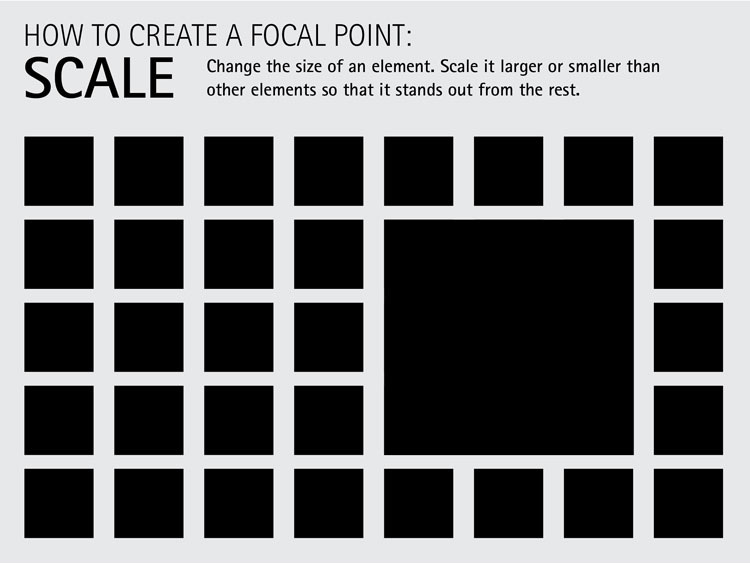
Good design creates clear focal points. Poor design has none, forcing the mind to try and decide where to focus. This is confusing and exhausting to the viewer, and most will simply give up trying.
Good writing also has focal points. The most important information should be easy to identify. Readers in a hurry should be able to jump to that most important text and get the gist of what you’re saying.
Poorly designed writing gives equal weight to every word. You may think every word is important, but your reader won’t.
If everything on the page seems important, readers will decide that nothing is important.
When speaking, we naturally put emphasis on the most important points. We enunciate more clearly, talk more loudly, and even repeat the key point to ensure everyone has heard us. You can do the same thing when you write.
Italicize words for emphasis.
Bold or highlight the most important sentences.
Use single-sentence paragraphs to make key lines stand out.
Repeat yourself: Create focal points.
Put the most important information at the beginning of a paragraph, not the end, and definitely not the middle (unless you want the reader to miss it.)
You may have learned in school that such blunt writing tools were cheap tricks. But you’re not just a writer, you’re an entrepreneur. Forget “elegant” writing—your goal for ergonomic writing: useful, functional, and efficient.
USE EVERY TRICK AT YOUR DISPOSAL. EVEN ALL CAPS.
But don’t overdo it with the emphasis. Again, if every word seems important, nothing will.

In design, what you don’t see is just as important as what you do see.
White space is a critical element in good design, one that takes time to appreciate. Young designers want to use their new skills to cover every pixel. Good designers know that white space is what makes their work stand out.
This principle is just as important in your writing.
Meredith Metzker, a journalist-turned-content marketer for SaaS startups, calls it “writing with white space.”
“Use the page like a designer uses white space,” said Meredith. “Let your words breathe and stand out.”
White space is an essential counterpart to focal points. Without white space, you have a wall of impenetrable text. Researchers have found that a lack of white space (specifically a small margins and tight line spacing) can lower reading comprehension. If you need proof for yourself, just try reading a research paper in an academic journal.
Creating white space starts with your sentences and paragraphs. Keep your paragraphs short—typically no more than three sentences. And don’t be afraid to use single-sentence paragraphs to break up the monotony.
Next, use bulleted lists whenever possible. These create large blocks of white space that break up your writing nicely.
Finally, take time to develop the right message so that you can say less.
Using white space in emails
White space is especially important in emails, which is where you’ll conduct the majority of your writing. White space makes emails more clear, focused, and effective.
No one writes a more clear and effective email than Trish Bertuzzi.
Trish is the author of The Sales Development Playbook. She’s mastered the art of writing sales emails that convert. White space is a fundamental element of her success.
Trish is a proponent of short emails that take the shape of a capital F.
The first paragraph starts off long, and lines get shorter and shorter down the page. This pattern creates a natural “funnel” design—a clear direction for the reader.
Here’s an example of an email I used when drumming up business for my content marketing agency.
Hey Lauren,
I really liked [Company]’s blog post on switching big data platforms from Amazon AWS to Snowflake. But I noticed it’s the only article you’ve written this quarter.
Companies that publish at least once per week see 10x the return on their content marketing.
Have you ever considered ramping up your content efforts?
If this interests you, let’s talk.
Best,
Ben
When writing sales emails, avoid bold or highlighted text. This looks spammy and will be an instant delete.
Instead, create focal points with white space and the shape of your email.

Chris Do’s biggest pet peeve when critiquing design: Legibility!
Amateur designers often sacrifice readability for style. This type of design serves no one but the designer.
“Legibility should supersede every other consideration,” says Chris.
Legibility means, “The quality of being clear enough to read.”
This is the best possible advice for writers, too. When writing for business, clarity is your number one priority.
Forget style. Forget sounding smart. Forget the rules of grammar you think you should follow. Your job as a writer is to find the fastest path to clarity.